Case Study
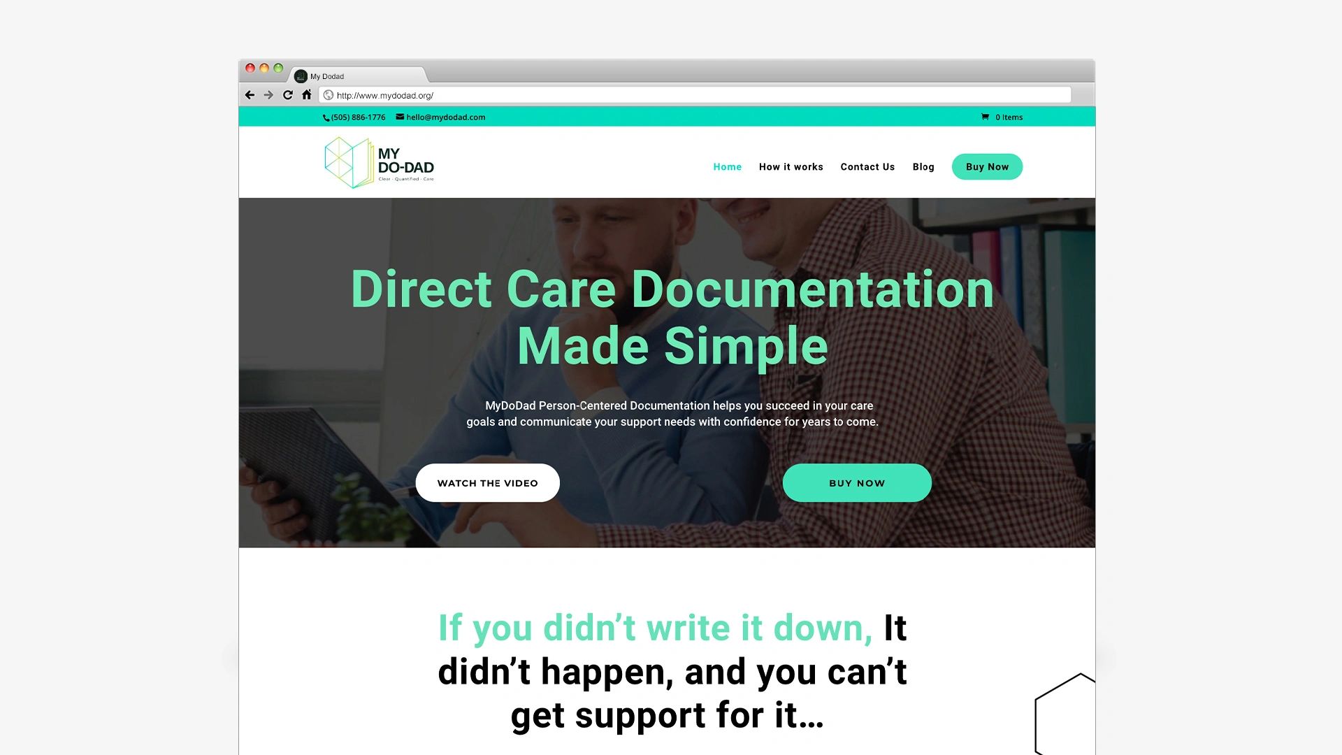
Website Design My DoDad
A website designed to assist caregivers in their care duties and help them to communicate their support needs through Person-Centered Documentation.
About The Company
My Dodad is a company that focuses on Person-Centered Documentation for people with disabilities. It assists caregivers in providing better care and obtaining better support by enhancing their knowledge and understanding of the support they require and the amount of support they receive in reality.
The main challenge was effectively showcasing their services, vision, and the tangible impact of their software on customers’ lives. They aimed to achieve this without coming across as overly promotional, focusing instead on genuinely grasping and relating to the real difficulties their clients experience. Their software isn’t just designed for individuals with disabilities, but also for the caregivers who navigate these challenges daily. Moreover, they wanted the website to reflect the accessibility they aspire to provide for all users. It’s a space meant to be easily navigated by both individuals with disabilities and their caregivers.

The Challenge and The Solution!
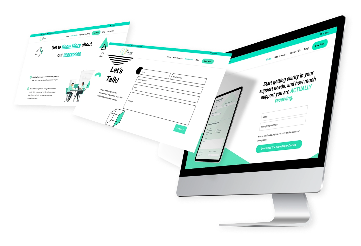
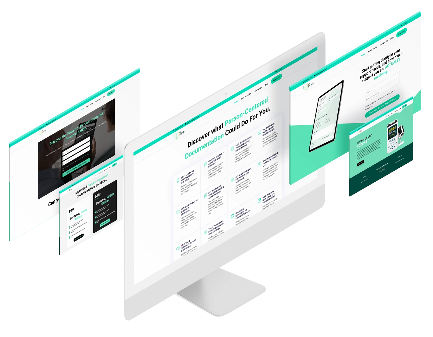
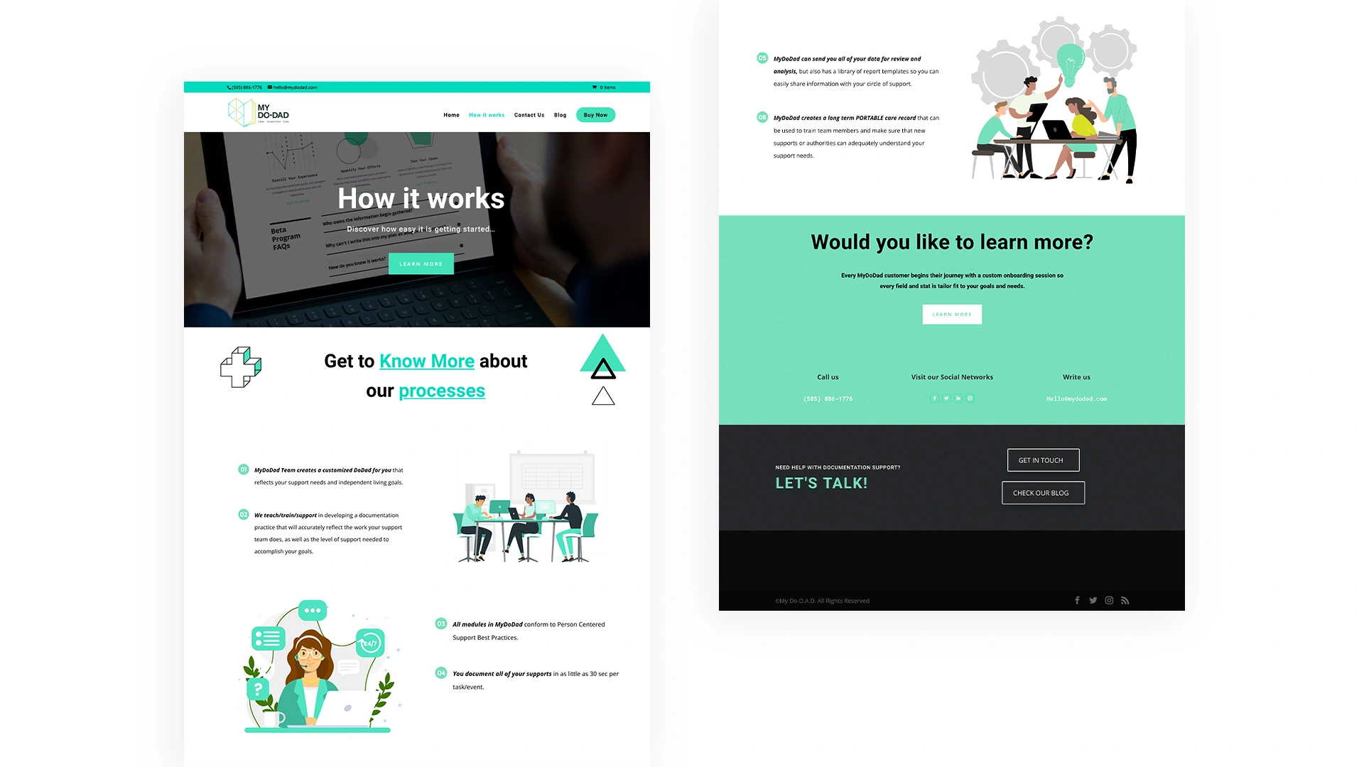
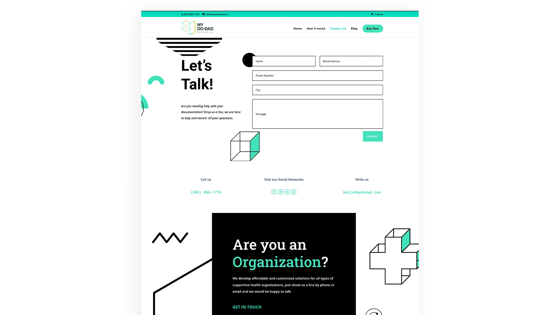
We developed a website that is easy for users to navigate by utilizing UI/UX design methods. In the process, we considered the characteristics and needs of our target audience, as well as the primary objectives of My Do-dad company, which is to showcase the software’s features and the benefits it offers to caregivers.
Each page was designed with the user experience in mind, and a user-flow was created that includes all the necessary calls to action to drive conversions. At the same time, we were careful to integrate elements that enhance accessibility, such as choosing the right font, colors, and shapes.
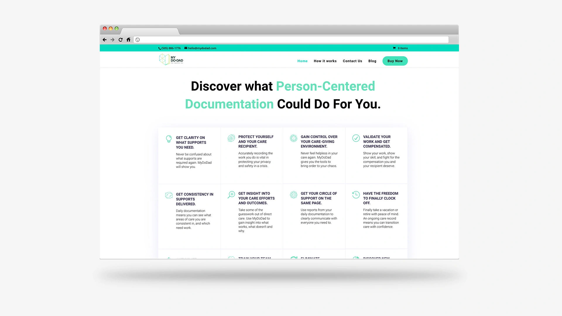
The primary objectives of this website were to help users understand the benefits of the software and how it can simplify their daily activities, highlighting its characteristics, features, and potential results as an easy solution for documentation needs.
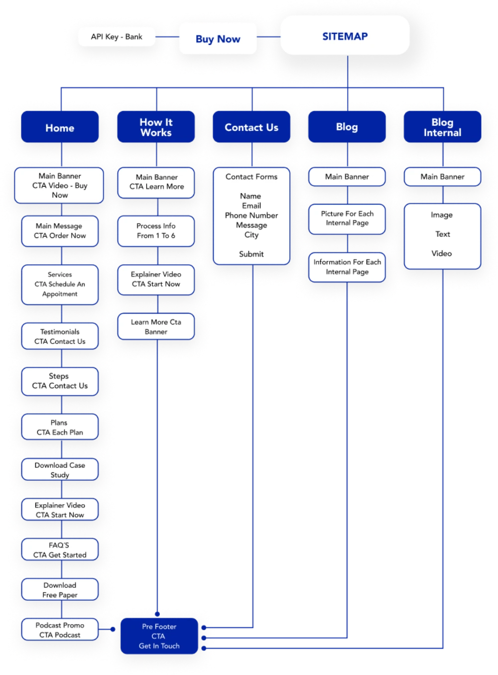
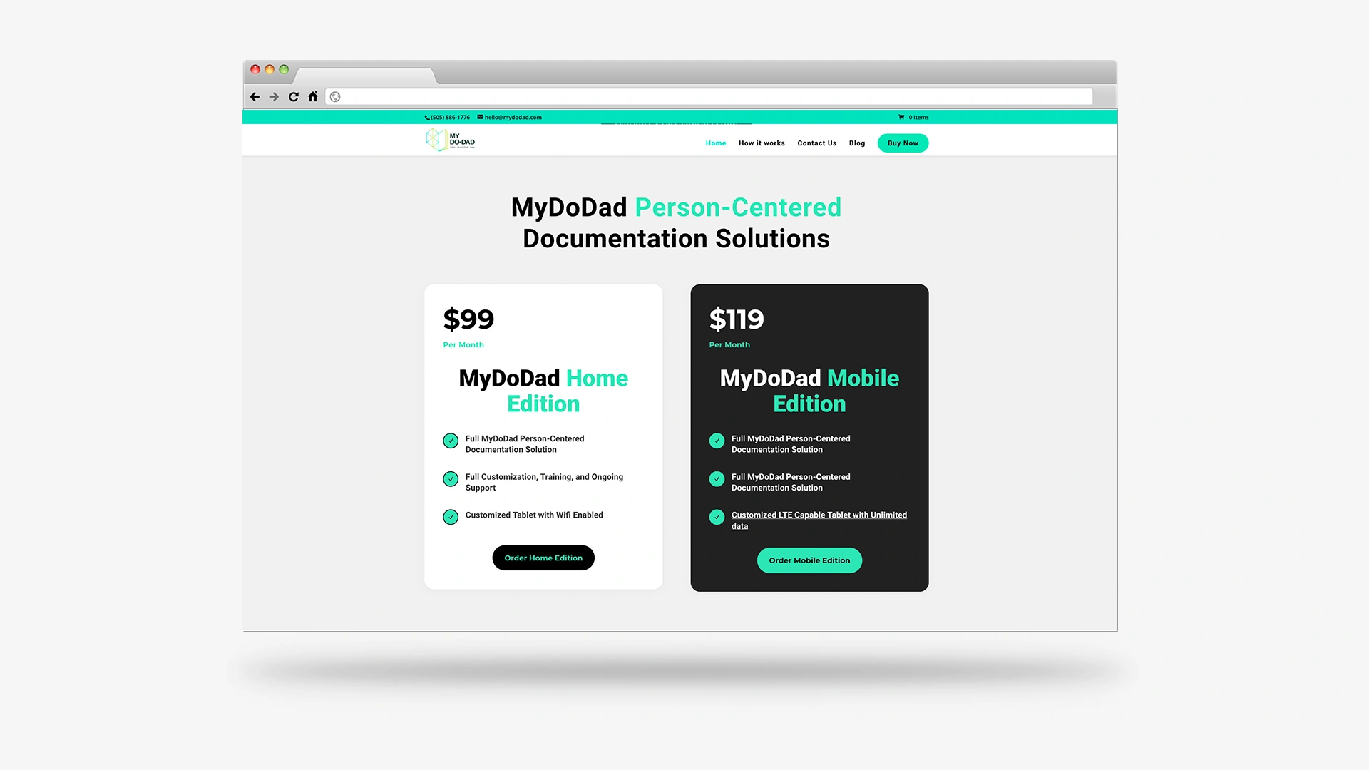
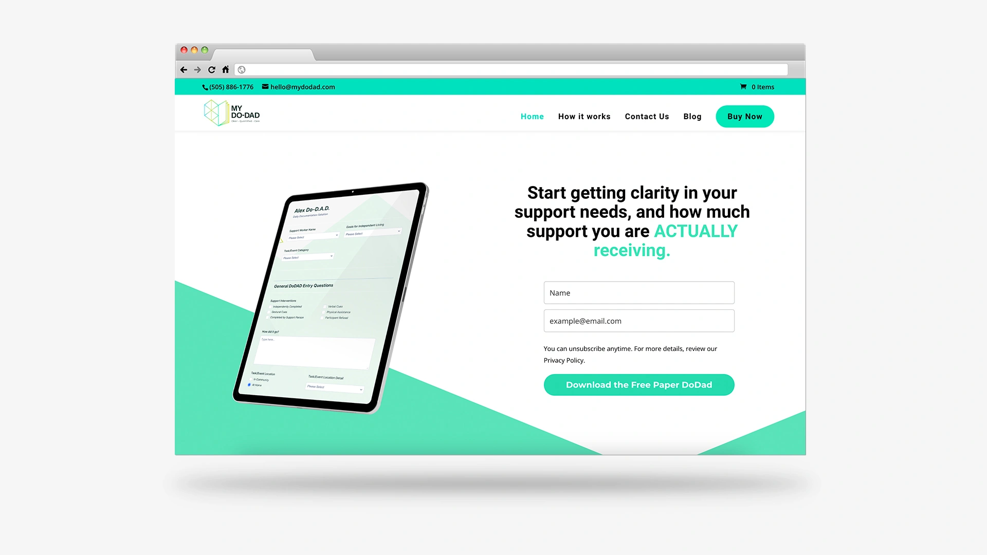
The secondary goals were to generate three primary conversions: purchasing a monthly plan, contacting the company, or scheduling an appointment to learn more about the software.
To accomplish these goals, in collaboration with the company’s CEO, we designed an information flow that followed a conversion funnel. At each stage of the flow, we included buttons that directed users towards the desired actions.

Ideate & Prototype
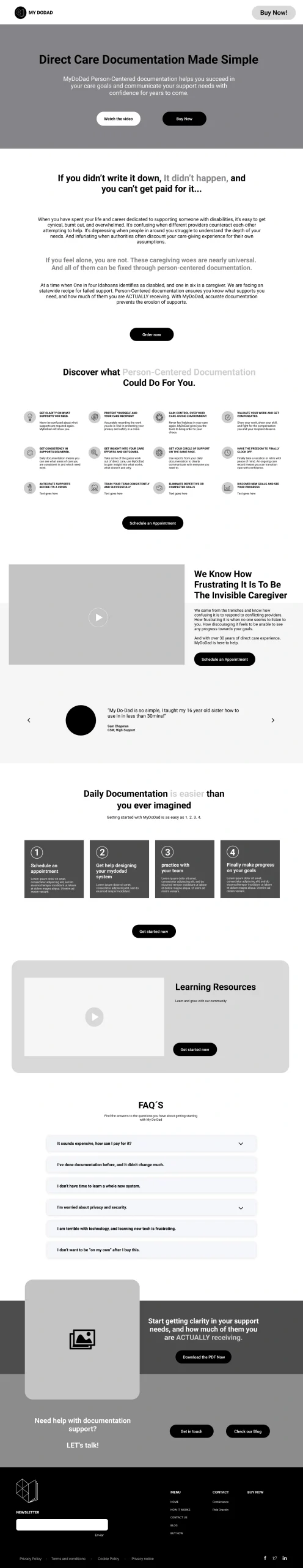
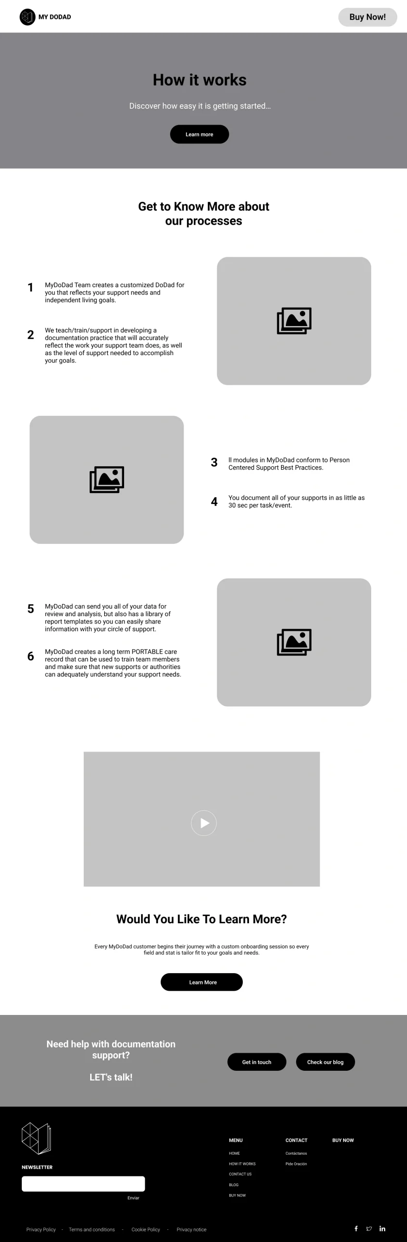
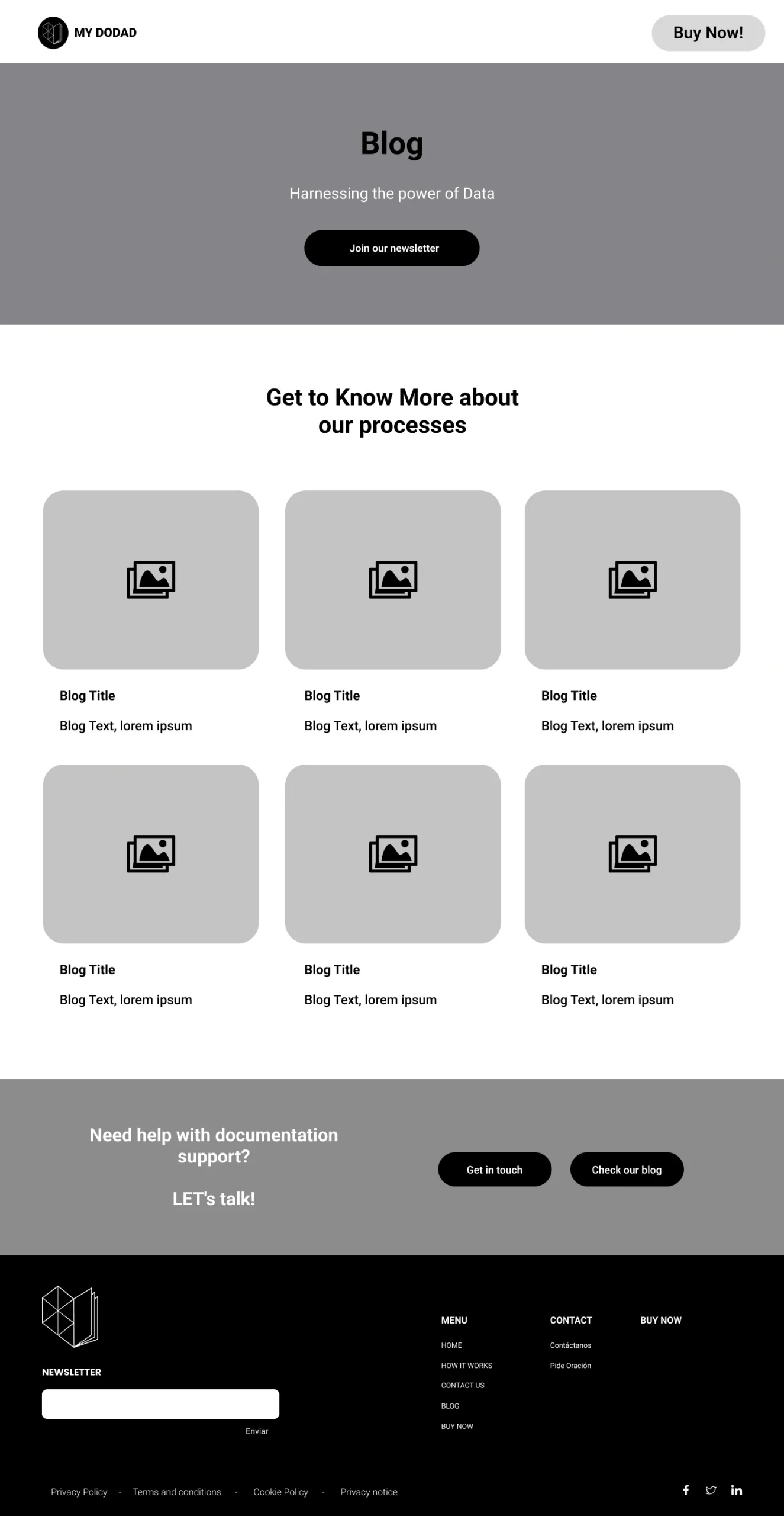
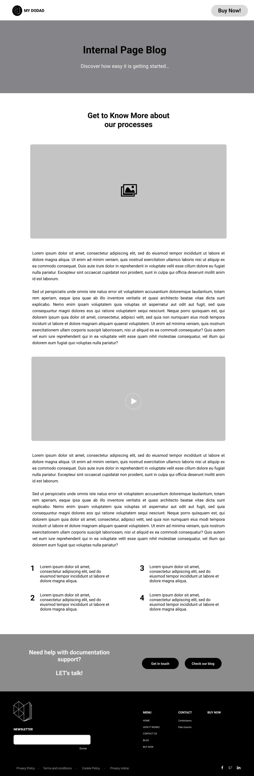
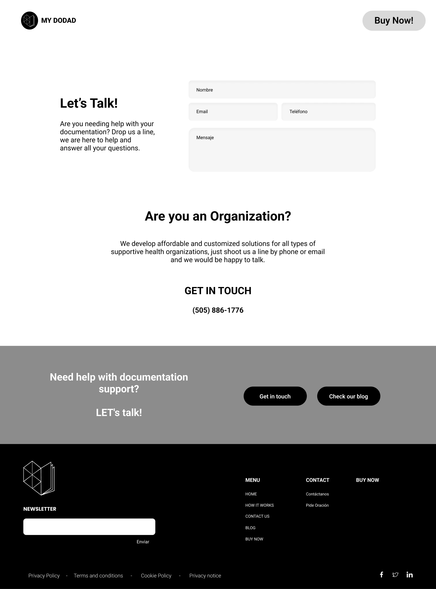
HI-FI Wireframes

The Results
The outcome was a website that is not only inviting and visually appealing, but also user-friendly and accessible. It effectively conveys a message of peace and support for caregivers and the people they care for, communicating clearly that there is a solution to their documentation challenges. This solution is easy to adopt, seamlessly integrating into their daily activities and lives.